Portfolio

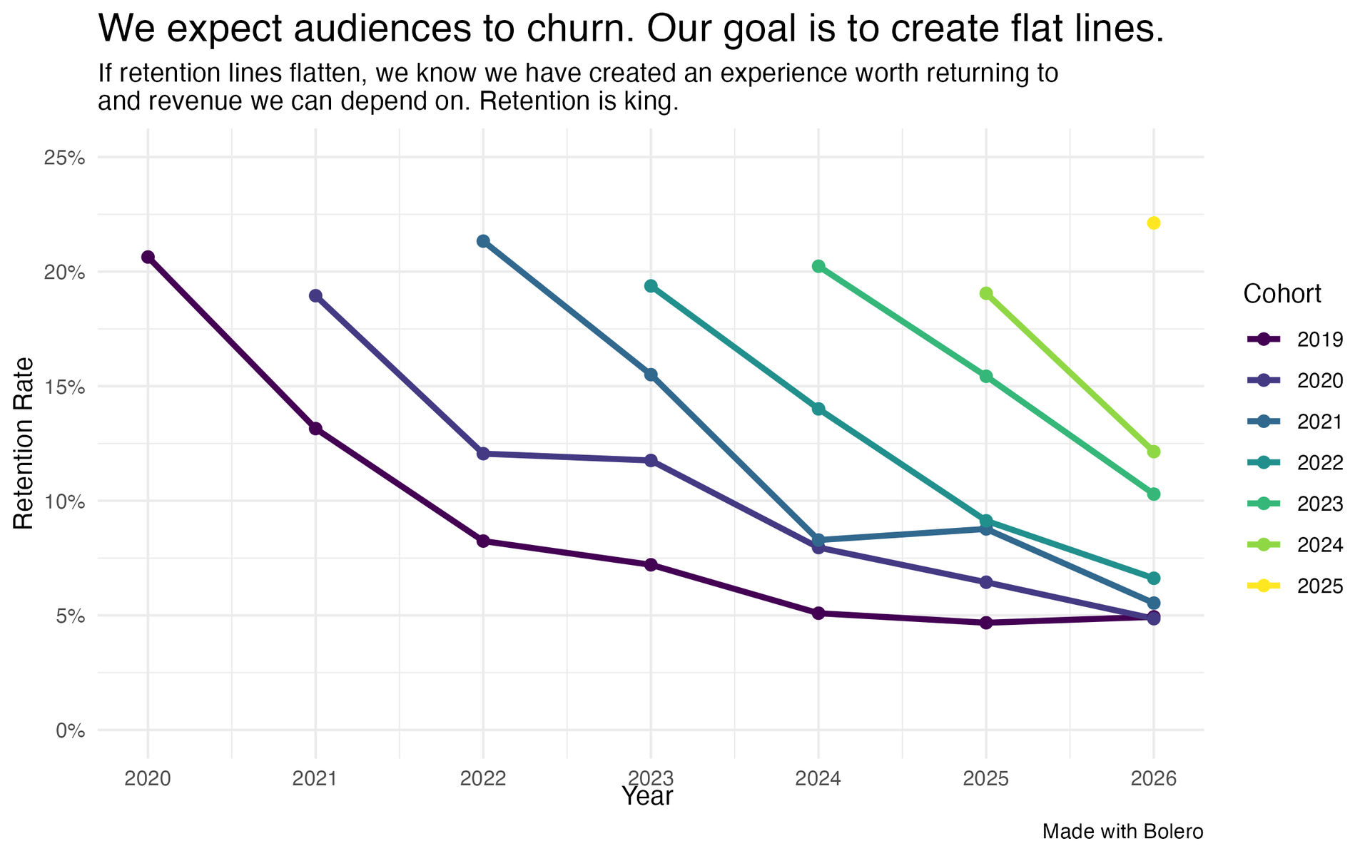
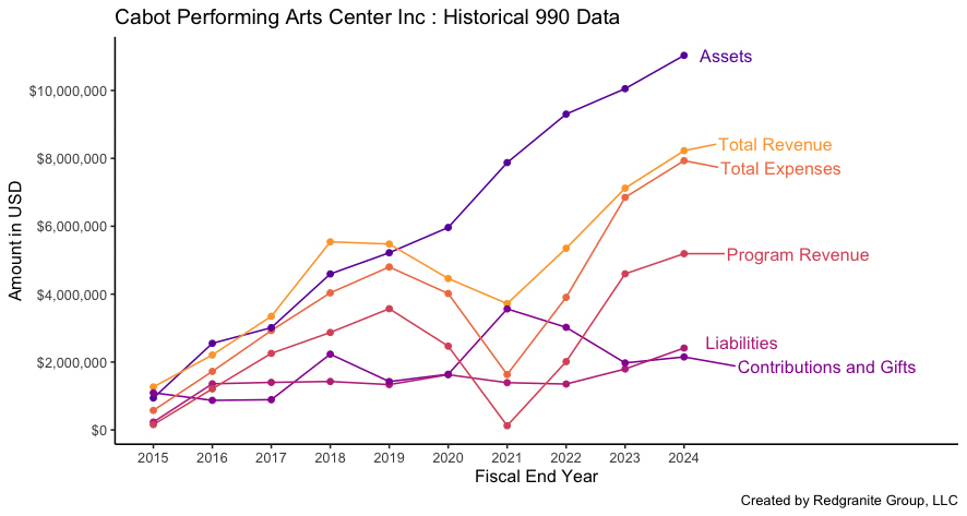
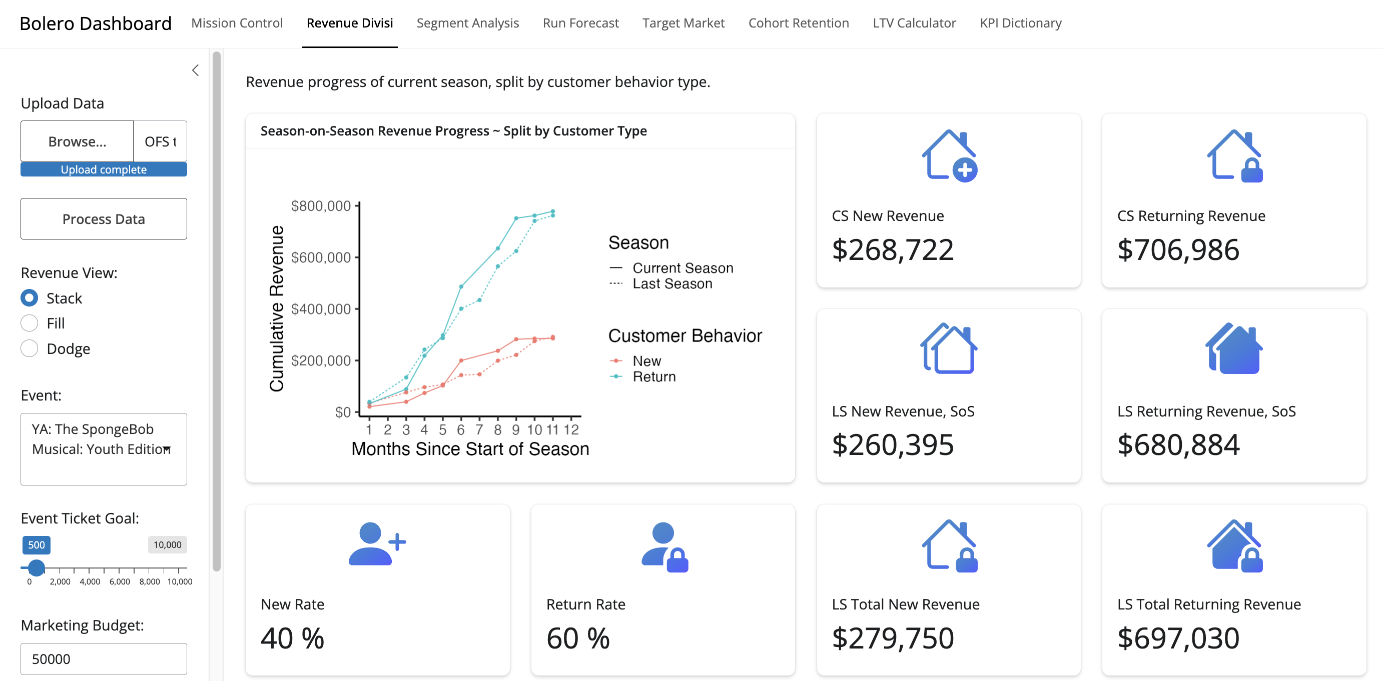
Below is a running list of (what I think are) interesting vizualizations I’ve made recently. I’ve added a small caption to each to give a bit of context.

IRS Tax data showing historical trends of individual organizations. Single function generates colorblind friendly pallette of lines by querying self-assemebled/scraped database. Graphics generated by function plus database leading to high open rate on cold market emails.

Extracted amplitude envelope of soundwave for live performance of Ravel’s Bolero to use in marketing materials for Bolero Dashboard. Scraped YouTube audio then smoothed ~16 minuetes of audio/samples to generate aesthetically pleasing and domain relevant backdrop for pitch deck and marketing mateirals.

Screenshot of Revenue Divisi page of Bolero Dashboard showing YoY Revenue changes for new and returning customers. Custon dashboard written as Shiny App allows users to upload ticketing data to platform and have complex, data-intensive workflows automated within seconds as Micro-SaaS. See www.bolerodashboard.com for product. offering.

Animation showing growth of non-profit performing arts groups in select regions of USA over time. Client requested specific keywords to find in organization’s name for marketing leads. Same dataset also had information on year of formation, so created plot showing number of organizations (non-sensitive regions shown).

Local group of start-up founders found click-bait style article saying Maine was not growing as quickly as other states, so downloaded regularly updated goverment data to show them this KPI has too high of variability to take seriously o quarter-to-quarter basis

Visualization of total avalible market share for Bolero Dashboard generatd by plotting all revenue from programming and contributions on log scale across select target keywords. Used in pitch deck for on-going funding to support product

Collapsed version of above chart to show how higher revenue organizations can skew average results. Generated for specialist audience to communicate specific point of confusion on why averages appeared so high in some categories and why important to consider large numbers on log scale for visualizing.